For years now I’ve been planning to eventually create a menu for accessing Cogmind’s lesser-used “special commands,” features not only requiring the keyboard, but even all assigned to Shift-Alt key combos. So these rarely needed (but still sometimes useful) features were already pretty clearly grouped together as a unit by their annoying modifier, but ideally they should be easier to trigger, not to mention also more readily available to mouse users.
I waited quite a while to implement this menu, mainly because I wanted to design and build it for a more stable and complete set of special commands, one that we couldn’t really be sure about until later in development (and sure enough these features have been gradually expanding and fluctuating over time, coming to a head in the current Beta 11). In the meantime it wasn’t an especially pressing issue because, again, these aren’t exactly commonly needed features, so occasionally requiring a player to wrangle with awkward commands via Shift-Alt-[“some-letter-I-forgot-because-I-rarely-use-it”] wasn’t all that terrible. Even with the advent of a dedicated “Special Commands” interface, the Shift-Alt-[letter] approach is not going away–it’s still available for those who don’t mind, or even prefer it, but as you’ll see we also gain other benefits in the process.
All you need to do is press Spacebar and a new menu pops up with a range of options originally only covered by one of these Shift-Alt-modified keys, and the menu allows both button access via mouse or hitting the corresponding key to enter a given “special command” (basically a blanket term for less commonly used UI features).
There are lots of advantages here:
- Allows mouse access to special commands
- Players aren’t forced to use Shift-Alt for these commands (especially on non-Windows systems, where the use of Alt can be problematic), where Spacebar+[letter] will do
- Feature discovery is greatly improved, since all relevant options are listed following a single keypress
- No need to remember the letter associated with each command, since those are listed as well
- Having an explicit menu visualized in the interface also offers an easy way to describe what each feature does
The menu appearance is animated in standard Cogmind style, but input is accepted as soon as Spacebar is pressed to keep it responsive for people who simply want to use this as an alternative way to enter keyboard commands they already know, for example Spacebar+s to dump stats, without the window annoyingly popping up in between the keys. In fact, for this purpose the window even has a slight 150-millisecond delay after pressing Spacebar before it appears, a delay that isn’t really noticeable for someone using the mouse, but plenty of time to enter a second key.
Before actual implementation, as always I used REXPaint to design the general layout of this menu based on its intended functionality, and to inform later UI coding work. I streamed the process when getting started, in this video where I also covered REXPaint and glanced at other past UI designs:
It’s not exactly the most exciting piece of UI design, especially since for consistency sake it mostly draws on existing simple elements from prior window designs, though I’ll cover some of the design evolution here.

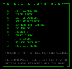
The initial mockup drawn on stream in REXPaint.
The first iteration above aimed at simply getting all the likely elements into a box and work from there, so it uses a pretty typical title and border style (the missing notch in the bottom-right is for a potential close button, which in Cogmind uses a different double-width character so can’t be shown in this same REXPaint file), shows the full list of commands we’ll be including (11 in all), and includes two separate sections of gray text, one to point out that the commands can also be entered directly via Shift-Alt, and another to provide a description for each button/feature as the mouse hovers over it. As this is a mockup, the gray text is not actually written out in its final form (or even to make sense :P), just copied from elsewhere as I was moving things around to get an idea of layout. Real content comes later.
Having a vertical list of options is generally ideal as far as menus go (especially alphabetically-listed options), but the problem here is that, at least all other things equal, a tall-style window ends up limiting the amount of horizontal space available for command descriptions unless they potentially span numerous lines, which doesn’t make for good reading.
Something wider would be preferred, so let’s split the options into two columns…

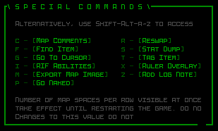
The second mockup continued improving the layout on multiple fronts.
Unequal column length aside, this will generally look a bit better insofar as giving us more horizontal space for descriptions. Also here I split up the two gray text areas by straddling the options, since keeping them apart seems to make sense given they have different purposes, one static and another dynamic.
Altogether it was looking better, but I didn’t really like the unequal amount of space afforded to the option rows, and decided to equalize that:

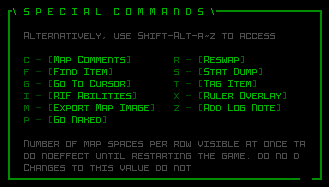
Further refinements with a third mockup.
In this layout the UI looks less lopsided, which while not a necessity (either could work), I preferred this aesthetic, plus we even get a little extra room for the additional text.
Now there’s no way I’m doing my best work while streaming, certainly not alongside an unavoidable loss of focus due to chatting and whatnot, and streaming or not I tend to sit on things like this (any kind of design work) for a bit after an initial pass and revisit them for refinement anyway. Sure enough, later that afternoon after some hours away from it I took another look at the interface and immediately had a new take on it…
What started it was that I didn’t really like the idea of this being a relatively small floaty window out over the large map view. We don’t really have those in Cogmind–windows are usually either large or connected to some other associated object or UI element, but in this case it’s a general-purpose feature menu so doesn’t have a natural place in the interface to associate with.
I thought it’d be better to try to redesign it with an eye towards having it occupy more space, and in that vein came up with an aesthetic pretty different from what we had going before, but very much in line with other pieces of the UI which offer functionality not entirely unlike this one: Cogmind’s options menu and commands reference pages!

Fourth and final mockup, quite different from the others but I like it!
The above mockup assumes that the window appears over the map and extends out to either side of it in both directions. The button style already matched the options menu (as does the help text), and now the header and border does as well.
Other improvements in the final mockup:
- Some commands were renamed, ideally so that their first letter matches the associated key.
- We actually only need one section of gray text, rather than two, because we only need the descriptions available specifically when the mouse is hovering over a button, otherwise it can display the “default” message about Shift-Alt access.
- The extra width allows for even longer descriptions without newlines, where instead each description will be written to keep it within the length seen in the mockup above (too long is also bad). This also allows the window layout to be more consistent since we don’t need to leave room for potential additional lines.
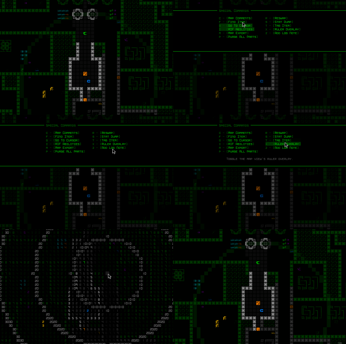
Here is the final implementation in action:

A demo of Cogmind’s new Special Commands window, here using it to activate the map ruler overlay.
Notice how the special commands menu is not vertically centered on the map. This is to leave some environmental context around Cogmind while it’s open, for reference. Not exactly a very important feature, but there’s room so why not 😀
During the polish phase a few automations were added for convenience when it comes to mode switching and feature toggling. For example, Spacebar will automatically deactivate an active map ruler overlay since this will generally save time, particularly for mouse users who otherwise have to open the menu and click on the button again to toggle it off, and there’s seemingly no real reason one would need to keep the ruler on and then also access a second special command at the same time.
There are a few Shift-Alt commands not found in the menu, all three of which probably almost no one ever uses anyway, but they also require holding the key to take effect, so probably aren’t all that compatible with this menu approach anyway.
As for mouse access to the menu itself, I considered enabling that via middle mouse button, but that already has a somewhat more important use (plus again special commands aren’t that commonly needed…). Spacebar is also big and relatively easy to hit in these cases. I also considered having a clickable button on the main UI that could be used to open this interface for even better discoverability, and completely not needing the keyboard at all, but don’t really want to go that far just yet–it’s probably not all that needed compared to the extra clutter it would add for such low-use features.